Check your print proof at the size people will hold.
Move a printed piece away from the oversized design canvas and review the words, hierarchy and intended action in a realistic physical context.
4 min read · Practical ideas for a stronger first impressionThe useful bits.
Review the actual words at the intended physical size.
Separate layout approval from supplier production approval.
Check the corrected file against the specific feedback.
Begin with the piece someone will receive.
A flyer can look clear on a large monitor and still need a closer look at its intended size. A contact line that feels generous on the canvas may be much less comfortable on the piece someone holds. Begin the review by naming the format, the audience and the ordinary situation in which the printed item will be read.
Use the agreed dimensions as the starting point, and distinguish a layout review from a production proof. A local print can help you judge size and hierarchy, but it does not establish how the final supplier, stock or finishing process will behave. Keep those separate questions visible rather than treating one reassuring preview as the answer to all of them.
Read the important information first.
Before judging the illustration or colour, read the exact business name, contact route, dates and other essential details against the current approved reference. Check every character. Familiarity can make an old address or an incorrect date look plausible when the eye is moving quickly through a polished layout.
Then decide which information should be noticed first, second and third. The main message needs a clear place to begin. Supporting details should help someone understand it rather than compete for equal attention. If every element is trying to lead, describe the specific conflict so the next revision has a practical job.
Try the intended size in an ordinary setting.
View a copy at the agreed physical dimensions. Hold it at a sensible reading distance for that particular piece, and ask whether the essential words can be read comfortably. Try the actual amount of text rather than a shorter placeholder. Look at wrapping, crowded edges and the space around the main action.
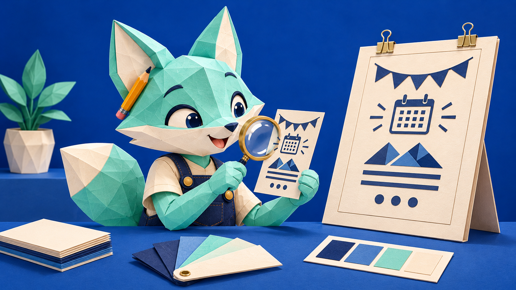
For a fictional example, imagine Juniper Hall preparing a small workshop flyer. The illustration reads clearly, but the enquiry address sits too close to the lower edge and the date competes with a decorative badge. The useful feedback names those two locations and the intended reading order. It does not ask for every part of the design to become larger.
Confirm the next action and the production questions.
Check what someone should do after reading. If the piece includes a web address, compare the printed wording with the approved destination. Where a scannable code is supplied, test the actual final proof in a controlled way and record the devices or conditions checked. A decorative representation in a mockup is not a functioning code.
Collect the supplier questions that remain open: the required file, dimensions, safe areas and any finishing details for this job. Ask the supplier to confirm its own requirements rather than guessing from another project. Record who is responsible for the final production check, and keep that approval distinct from an internal review of the wording and layout.
Review the corrected proof once more.
After revisions, compare the actual corrected version with the agreed feedback. Confirm that a change to the contact area has not displaced another essential detail. Keep the reviewed filename and date with the notes, so a later export cannot quietly become the version everyone assumes was checked.
Try this on one upcoming printed piece. Record the intended size, verify the important text and inspect the main action in context. If the layout needs a clearer hierarchy, prepare a focused design brief with the actual wording and the placement that needs attention. A modest, repeatable proof check is more useful than an impressive-looking canvas that nobody has read.