Make one next step easy to find.
A service-page opening works better as a clear introduction to the offer and the next useful action.
4 min read · Practical ideas for a stronger first impressionThe useful bits.
Give the opening one primary visitor task.
Review a button label and its destination together.
Check the same decision on an actual phone layout.
Decide what the visitor needs first.
The opening of a service website has limited space and a practical job. A visitor needs to understand what the business does, decide whether it seems relevant and find a useful place to go next. Start by describing that first decision in plain language. Someone looking for a renovation service may want to compare the kinds of projects offered. Someone returning to an existing provider may be looking for contact details. Choose the primary task for this page instead of asking one opening section to solve every possible visit at once.
Give each line a different job.
Use the headline to introduce the offer, then let the supporting line add a useful detail. Avoid making both lines repeat the same broad promise. A navigation label can stay short while a service description explains what is included. Read the opening without the photograph and decorative elements. Does the language still give someone enough context to choose a next step? Then put the visual elements back and check whether they support that explanation. A strong image can establish a mood, but important information should not depend on a visitor guessing what the image means.
Name the destination of the button.
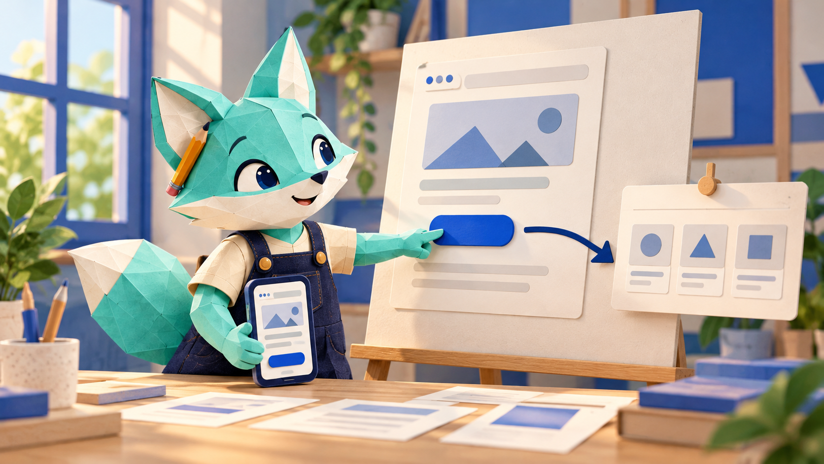
A button is a small piece of a larger route through the site. Its label should make the next page or action understandable. Explore services makes sense when it leads to a service overview. A contact action should lead to an available contact route, with clear information about what happens there. Follow the link yourself and read the destination as a visitor would. An attractive button is not a working journey if its target is missing, confusing or disconnected from the promise made in the opening. Review the label and destination together rather than treating them as separate tasks.
Check the same decision on a phone.
A desktop layout may show a headline, photograph, navigation and several service cards at once. A phone presents those elements in a different order and with less space. Check whether the main message still appears clearly, whether the next-step button remains easy to find and whether the text can be read without awkward zooming. The fictional Field & Form concept accompanying this article shows a related laptop and mobile direction. It is an illustrative mockup, not a live customer website. A picture of responsive screens is useful for discussion; the implemented page still needs actual device and interaction testing.
Remove competition before adding more.
When an opening feels confusing, adding another badge, sentence or button may make the decision harder. List what each element contributes, then look for repetition. Keep information that helps explain the offer or supports the immediate choice. Move deeper detail to a place where a visitor has already chosen to explore it. This does not mean every page needs the same sparse layout. Different businesses have different information needs. It means the order should be intentional, so a visitor can understand the first step before being asked to consider several unrelated actions at the same time.
Review the whole route.
After checking the opening, follow the primary action through the next page and any available form or contact link. Check the language, working destination and information someone needs to continue. Use real intended content rather than a perfect short placeholder that hides layout problems. Revisit the route when services or contact options change. Explore the HelloSiteWorks website templates at https://hellositeworks.com/templates for the current design direction. Template examples and fictional studies are creative references; browsing them does not demonstrate a completed customer website, an active paid checkout or a guaranteed change in enquiries.