A mascot needs more than one pose.
A good character stays recognizable while greeting, explaining and celebrating. Plan those uses before the final artwork.
4 min read · Practical ideas for a stronger first impressionThe useful bits.
Choose poses around the places the character will appear.
Compare defining features across every expression and action.
Review separate exports in the layouts where they will be used.
Begin with the character’s job.
A mascot has to belong somewhere. It might welcome people on a homepage, point out a useful detail in a guide or bring personality to a social announcement. Start by writing down those uses. A friendly wave can suit a greeting, but it may not help when the character needs to explain a complicated step.
Decide on the personality before collecting decorative features. Is the character curious, reassuring, energetic or a little mischievous? Pick a small number of traits you can show through posture and expression. A useful brief gives the designer something to direct rather than asking for a character that somehow feels like everything at once.
Make the silhouette do some work.
Look at the shape before the details. Ears, a tail, a tool, a distinctive outfit or an unusual stance can help a character remain recognizable when it appears smaller. You do not need all of those features. Choose the ones that support the personality and remain clear in the intended placement.
Try a simple silhouette view alongside the full-color drawing. If the character loses its identity as soon as the small decorations disappear, explore the underlying shape again. This is an editorial check, not a rule that every mascot must look simple. A richly detailed character still needs a clear focal point.
Give each pose a different purpose.
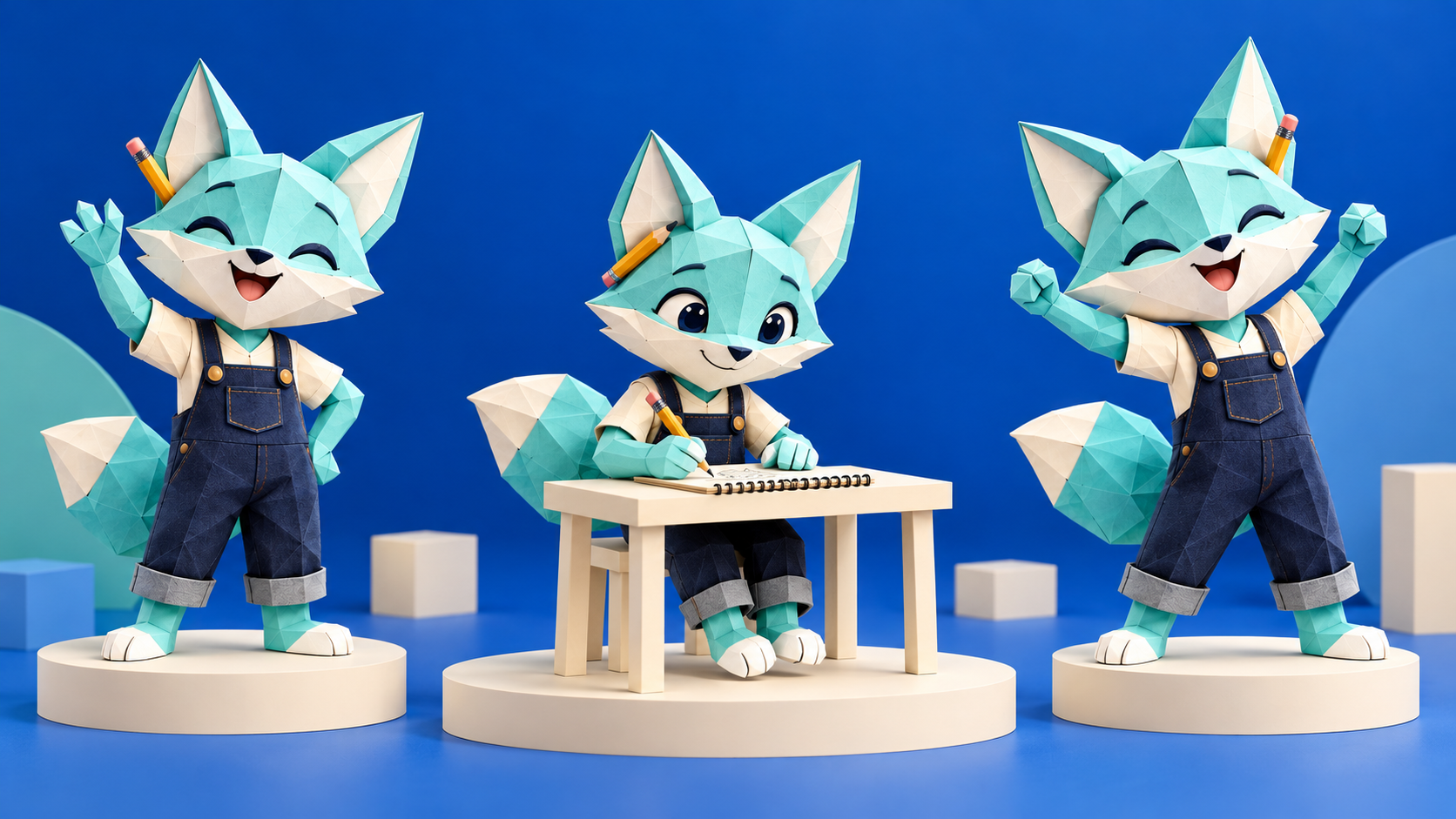
Three nearly identical standing positions are not much of a working set. Instead, choose actions that answer the brief: a welcoming greeting, a focused working pose and a moment of celebration. A restaurant may need a presenting pose; a practical service business may want the character carrying a tool or showing a completed task.
Keep the same character across those actions. Compare the head shape, outfit, proportions and defining features side by side. Changing the pose should not quietly change the identity. Review expressions too: cheerful, thoughtful and surprised should feel like three moods of the same character rather than three unrelated faces.
Review the poses in actual layouts.
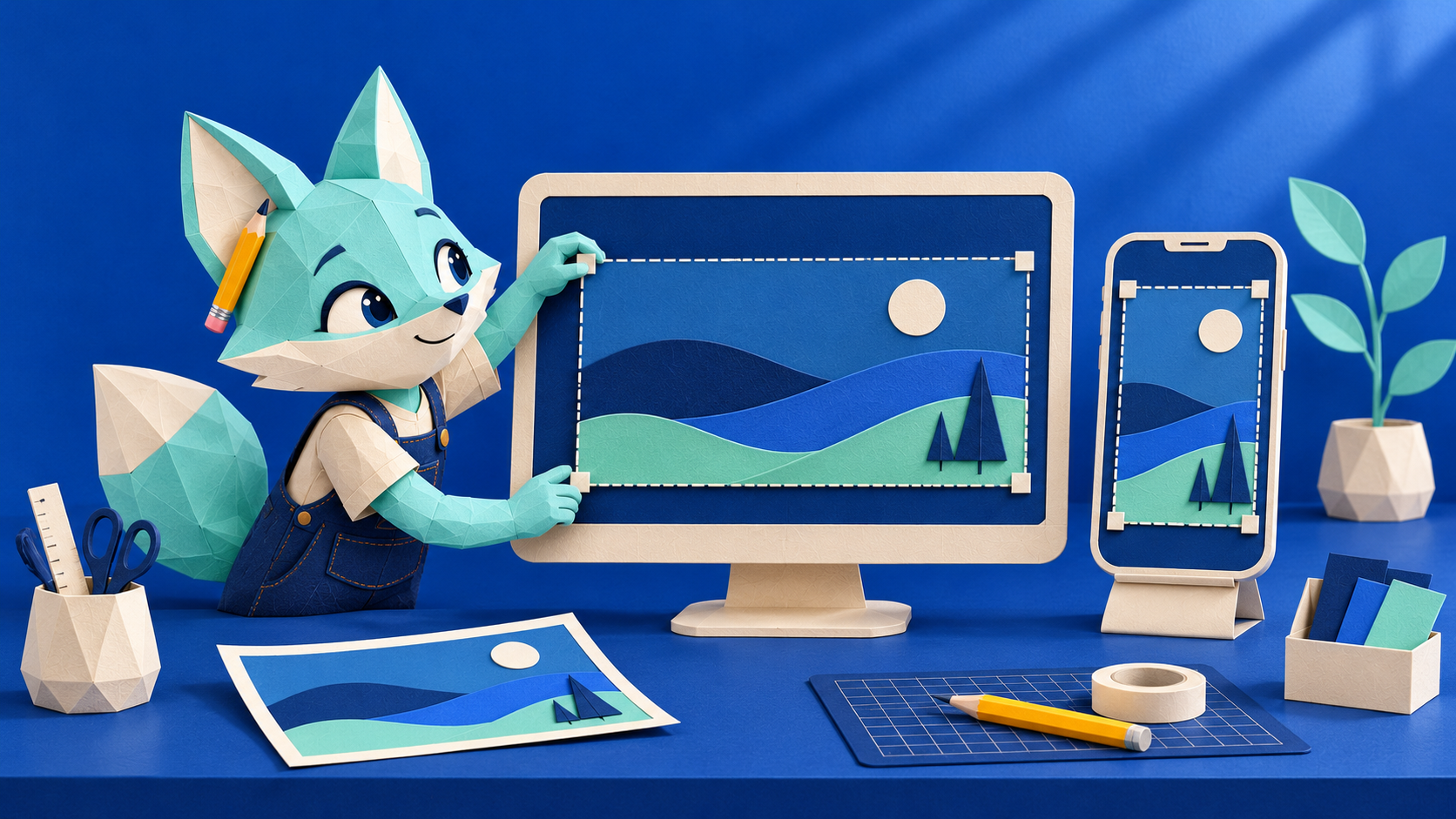
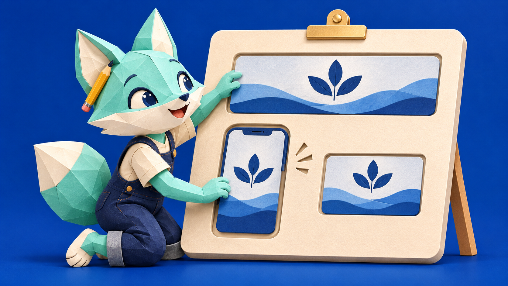
Place a draft in the spaces where it will appear. A character that fills an illustration board beautifully may become awkward beside a paragraph or inside a narrow social card. Check that the face remains clear, that a tail or raised hand does not collide with the headline and that the character has room to breathe.
Give the drawing a little space beyond its outermost features. A platform crop should not remove an ear, a foot or the end of a gesture. Review the whole character as well as the smaller composition. When a pose points toward something, make sure the layout gives that gesture a sensible destination.
Agree the handoff before calling it finished.
A concept sheet is helpful for choosing a direction, but it is not the same thing as a set of separate finished assets. Agree which poses and expressions will be delivered, which backgrounds are needed and which file formats suit the uses you named at the start. Review each exported asset individually rather than treating the presentation board as the delivery folder.
The fox shown with this article is a fictional concept study, not a client commission or HelloSiteWorks’ official mascot. It illustrates how greeting, working and celebrating can give one character room to express itself. Explore the mascot design page to prepare a direction; the current preview does not start production or collect payment.